

Colour is a powerful design element when used effectively. Use warm colours and luxurious textiles to create the cosiest winter lounge retreat.
Colour is a complex phenomenon and theories about its effect on our minds and emotions range across the scientific and artistic realms. On the other hand, all it takes is a paintbrush and a pot of fresh paint to understand that colour can dramatically transform a space and help give a room a particular mood. A confident use of colour and pattern in our home decorating can be a very personal expression of our creativity. Understanding a little colour theory can go a long way towards helping us make more effective use of colour and to be brave when venturing beyond the safety of white-on-white.
Hues and shades
Hue is another name for colour. It is pure colour that has not been mixed with black or white. A shade is a pure hue with black added. It will reflect less light and be darker than the original hue.
Tones and tints
A tint is a pure hue with white added. It will be lighter and reflect more light than the original colour. A tone is pure hue with grey added. It will be darker than the original hue.
Luminance and saturation
Luminance describes the amount of light that is reflected from a flat, painted surface. It gives us an indication as to how bright the paint will appear. Luminance decreases as more grey or black paint is added. Saturation refers to the intensity of a specific hue or colour. It is based on the colour’s purity: a highly saturated hue has a vivid, intense colour, while a less saturated hue appears more muted and grey. With no saturation at all, the hue is a shade of grey.
Warm and cool
In basic terms warm colours are found on the yellow/red side of colour wheel charts, while cool colours sit on the blue/green side. But there are subtleties; a cool yellow may have blue undertones and a warm blue could contain hints of red. A colour’s level of warmth or coolness will be affected by its intensity, with a highly saturated colour looking ‘hotter’ than a less saturated one. The warmth of a colour also depends on the warmth of the light shining on it. For instance, a colour painted in a south-facing room may look cooler and greyer than the same colour in a north-facing room.
Warm white with a hot accent
When we understand a little about how colour works on our minds, we can use it to set a mood. Neutrals with a yellow base lighten and visually warm a room. Resene Gin Fizz (used on the wall) is an example of a delicate but warm ochre-toned cream. Highly saturated colours, such as an intense red, make a dramatic accent and are softened and balanced by the mellow glow of gold.
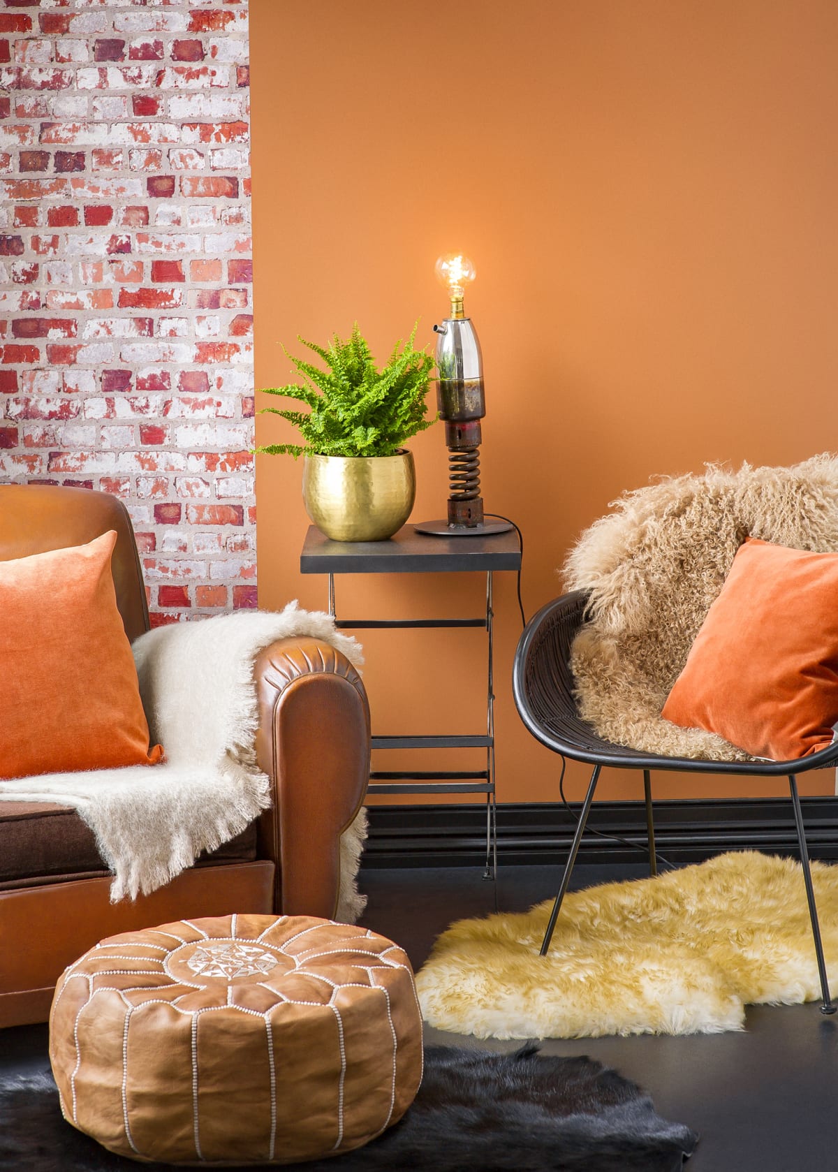
Rich, earthy tones
Key design elements of the 70s are back – with a modern twist – in both fashion and interiors. Not sure about brown? Think of the toasted colours of burnt brick orange, terracotta, burgundy, rust, ochre, cinnamon, deep copper and burnished brass. Use a patterned or printed wallpapered panel or wall to add the appearance of texture and to complement a strong paint choice, such as Resene Twizel (featured here). Layer up with natural textiles for a comfortable space that feels truly inviting and authentic.
Moody blues
Strong dark colours have the visual effect of bringing a surface closer, helping make a room look cosier and giving an open space a more intimate feel. Resene Barometer (wall and chair); Resene Blast Grey (chair).
Visit resene.co.nz and for more Resene makeovers with Good, click here.
